
Plotting Bar Charts with Pandas Dataframe

This blog will demonstrate how to quickly plot and edit clustered bar charts from Pandas without directly using the native matplotlib chart functions.
Pandas allows the user to plot all types of chart types using the plot() method. This method is very powerful as it can reduce the lines of code needed to plot a bar chart – it does this by taking advantage of the arrangement of the pandas dataframe and the parameters of the plot method.
Illustrated below is dummy data showing the performance of men and women across two tests, this data will be used throughout this blog. Feel free to copy the code and plot along!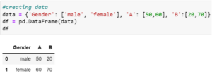 Figure 1: Creating dummy data for average scores between men and women in two tests (A and B)
Plotting clustered bar charts
This first plot is a clustered bar chart showing the performance of both men and women for each test: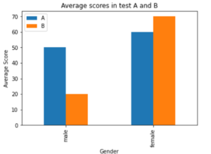 Figure 2: Average Scores for men and women in both tests
To plot the clustered bar charts shown in figure 2 using matplotlib’s ‘plt.bar()’, the following lines of code are needed: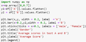 Figure 3: Code for plotting the clustered bar chart shown in figure 2 using matplotlib’s bar method
With the Pandas plot method, this is simplified to: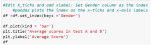 Figure 4: Code for plotting the bar chart shown in figure 4 using the pandas plot method
Code explanation:
- .set_index(keys = ‘Gender’) sets the ‘Gender’ column as the index of the dataframe in figure 1 (see figure 5)
- Pandas groups the plot by the column headings (i.e. each heading is assigned a colour in the plot)
- Pandas automatically set the index of the dataframe as the ‘xticks’ and the index name as the xlabel
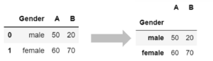 Figure 5: The movement of the gender column to the index of the dataframe shown in figure 1
Benefits of Pandas plot over matplotlib:
- Code complexity reduced
- Lines of code reduced from 10 t0 4
- Much easier to shift reference frame of bar chart:
- E.g., if you wanted to compare how each gender performed against each other in an individual test figure 2 is good but the figure below is even better:
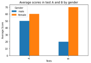 Figure 6: Average scores in test A and B by gender
- The code that achieves figure 6 plot:
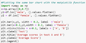 Figure 7: Code for bar chart in figure 6 using Matplotlib bar method
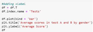 Figure 8: Code for bar chart in figure 6 using Pandas method
- The Pandas code is much simpler requiring only a dataframe transpose (see figure 9 for transposed dataframe) whilst the matplotlib code required the editing of most lines of code in figure 3.
![]() Figure 9: The initial dataframe(9A) and the transposed dataframe (9B) used to plot bar chart shown in figure 6
Figure 9: The initial dataframe(9A) and the transposed dataframe (9B) used to plot bar chart shown in figure 6
The plot method in Pandas reduces the complexity of plotting bar charts in Python. It also supports other bar chart styles such as stacked bar charts as well as other plots such as scatter, hist, area, pie, etc. Have fun exploring these!
Share

Connecting Python & Snowflake for Data Analysis | Rockborne
Explore the powerful integration of Python and Snowflake for advanced data analytics in our comprehensive guide, from setup to data extraction.
22 Jan 2024

Exploratory Data Analysis with Python and Pandas | Rockborne
Explore the basics of data analysis with 'Introduction to Exploratory Data Analysis using Python and Pandas', a guide for beginners to unlock data insights.
21 Nov 2023