
Stock Prediction Using Linear Regression | Rockborne

Comparing Relative Stocks Using Visualisation and Predicting Stock Prices with Linear Regression Modelling
(The opinions expressed in this blog are for general informational purposes only and are not intended to provide specific advice or recommendations for any individual or on any specific investment. It is only intended to provide education about analytical tools and the financial industry. The views reflected in the commentary are subject to change at any time without notice)
This month working at Rockborne, we have been delving into the vast world of python and its many libraries. Python has a huge amount of libraries that allow the programming language to be extremely powerful.
Our first aim is to compare different stocks within the same category using pythons data visualization tools. The next aim is to learn to predict stocks using linear regression modelling. By predicting future stock prices we can create a strategy for daily trading. It is relatively simple to predict stock prices using linear regression, the difficulty arises when trying to find the right combinations to make predictions profitable
Importing The Stock Data into Python
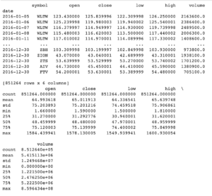
First let us import our stock data. In this case, we got our data from Kaggle. Once we have downloaded the necessary file, we need to load the file into memory as a pandas Data Frame.
Data
Importing Data Visualization Tools
For data visualization, we import the visualization tools and set the format of the graphs.
Data Preparation and Visualisation
The next step is to visualize and compare the stocks of real estate businesses, tech giants, and automobile companies. We will extract the data price for each stock from our DataFrame. Our plot tool will automatically set the x axis to the date and our y axis will be the ‘close’ (price of the stock).
Real Estate Closing Prices
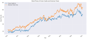 The stocks for American Tower corp are generally higher than that of Crown Castle. Both stock prices have a general upward trend with time. American Tower Corp and Crown Castle both focus on wireless and broadcast communication real estate infrastructures. With everything going digital it explains why both stocks are on an upward price trend. It also explains why the stocks have similar dips at similar times.
Tech Giant Closing Prices
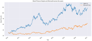
From our graph above we notice that the stock prices for Apple kept going up from 2010, which is after the release of the iPhone, whilst Microsofts stock prices seem to dip/ level off during the same period. Apple stock prices surged up at the start of 2012 but started to dip from mid-2012 to mid-2013 before it starts to pick up again. The first reason for this was because Apple iPhone sales grew by only 7% whilst they originally predicted an estimated 30% growth rate. The next reason was due to Apple’s profit margin dropping dramatically. For Microsoft, our stock prices increase/dip in a very steady manner throughout the period without any major surge in prices making it seem to be a safer stock due to its consistency, however, this comes at lower margins of profit if we were to trade this stock.
Automobile Closing Prices
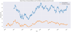 Next, we have stock prices for the automobile companies. One thing is clear, both companies are volatile and have no clear upward trend. General Motors and Ford both have major stock price drops from 2011 to mid-2012 before bouncing back to their previous highs. The reason for GM’s stock price decline was that on November 10th, 2010, GM became open to the public with its first IPO. This means the stock prices were based on the hype rather than the true valuation of the company. Whilst for ford the decline was caused by the CFO explaining that ford could lose as much as 2 billion in Europe in 2013 causing a big sell-off.
Daily Percentage Gain & BoxPlot Visualisation
Next, we want to find out the daily percentage gain for each of the stocks. This will be used to help us find out the most volatile stocks, and the best way to visualise this is using a boxplot.The daily percentage gain is calulated using the following formula: rt = (pt/(p(t-1))) – 1
![]()
<AxesSubplot:>
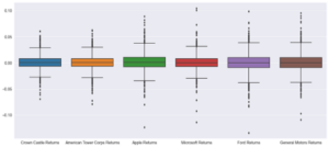
The box plot shown above is the distribution of the stock’s daily returns. The larger boxes and longer whiskers indicate the stocks with the most volatility. So in this case our most volatile stocks are GM, Ford, and Apple, and this can be confirmed by their graphs above. Making these the stocks that have the most opportunity alongside the most risk. Note that predicting these stocks is harder because of their volatility meaning more chances for an error in our model. Using this information we will build a linear regression model based on Apple, to find the best days for us to trade the stock to make a profit and determine how profitable our model is.
Linear Regression Modelling for Apple Stocks
Limitations and Assumptions
Our first assumption is that the variables in the data are independent. This dictates that the residuals for any single variable are not related, in this case, the difference between the predicted value and observed value. One issue we have is that our stock values are values of the same thing recorded in sequence since this is Time Series data. This is problematic because it produces a data characteristic that is called autocorrelation
Initialization
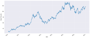
We will be focusing on Apple stocks because of how volatile the stock has been over the years. First, we pull the data for the apple stocks and then produce a plot of the data.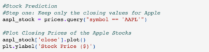 Text(0, 0.5, ‘Stock Price ($)’)
Filtering the Data for modeling
Next, we will filter our data for modeling and begin setting up our data for train data and test data.
 [[ 30.57285686][ 30.62571329][ 30.13857071]…[116.760002 ][116.730003 ][115.82 ]]Standardization of the dataset is an important requirement for our machine learning estimators. Using from sklearn.preprocessing import MinMaxScaler. The code allows us to transform features (in this case the closing price of a stock) by scaling each feature to a given range in our case 0 and 1. Fit_transform is used to scale the training data and learn the scaling parameters of the data.
 [[0.02971784][0.03021854][0.02560389]…[0.84616011][0.84587593][0.83725556]]
Developing the Testing – Training Dataset
Machine Learning requires a minimum of two data sets for effectiveness and accuracy. The training data and testing data are prerequisites for the model. We will split our training and testing size into 65/35 respectively. These percentages can be changed depending on how accurate our predicted values are. Our data has now separated the Dataframe objects to the nearest whole-number reflective of our 65/35 split (which is 1145 training samples, 617 for the test samples). (Note: we have 60 overlapping data points due to the -60). From our split, we obtain the training and testing data. The empty cells for x_train and y_train are going to be used to store our target and feature sets. We will import tqdm which just shows a smart progress meter of the number of iterations completed.
 100%|██████████| 1085/1085 [00:00<00:00, 188431.94it/s]
![]()
(1085, 1085) The next step is to reshape the data, this is because the LSTM model requires 3 dimensions
(1085, 60, 1)
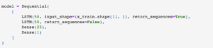
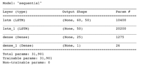
LSTM stands for Long Short-Term Memory. We use 50 layers and return sequence true because we will use another layer as an input shape. Next LSTM is 50 layers and then the return sequence is now false since we no longer need new layers for our architecture. We add a dense layer of 25 neurons of densely connected neurons network and then 1 for our last dense layer.

Epoch 1/4 1085/1085 [==============================] – 79s 65ms/step – loss: 0.0013Epoch 2/4 1085/1085 [==============================] – 71s 65ms/step – loss: 7.2455e-04Epoch 3/4 1085/1085 [==============================] – 55s 51ms/step – loss: 4.0209e-04Epoch 4/4 1085/1085 [==============================] – 71s 65ms/step – loss: 3.4963e-04
<tensorflow.python.keras.callbacks.History at 0x16f8b8e1fd0>
The batch_size is the number of training examples and the epochs are the number of iterations when data is passed back and forth through the Neurol network. As with the training dataset we now have to do the same method for our test dataset. Note: The more epochs the higher the chances of overfititng and the longer the process takes. You could also get a reallu good fit with just 1 epoch.
(617, 617)
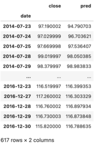
Finally, we can get the model to predict stock prices for Apple. Pred is the same as the data in our y_test dataset. Once we have this we convert the predicted dataset back to the original values.
 Next, we want to find the RMSE, coefficient of determination. Our Dataset has an RMSE of 1.9833 which is very accurate. A value of 0 means our model predicted the exact values that we were meant to get from our y_test values.
 Mean Absolute Error: 1.3102851491236263Coefficient of Determination: 0.9709304467420222Mean Squared Error: 1.819332791061345
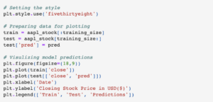
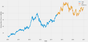
Visualising our Model
The configuration for our plot has now been completed and we can now visualize our Linear regression model. The model trains the ML for approx. 4.5 years of data and uses this to create the prediction for the stock. The test is the valid stock price if we had predicted accurately these two (Test and predictions) would match exactly on the graph. Although we don’t have an exact match we can see that our predicted stock prices are very accurate.

<matplotlib.legend.Legend at 0x16f919b1dc0>
![]()
Interpretation of our Analysis
We have trained the model on historical pricing data using the closing stock prices and using a 60-day period. The goal was to develop a model that can accurately predict the day’s closing price. Apple stock was chosen because it is a volatile stock.We will now use our model’s prediction prices for a trading strategy to assess how well our model performs.
Trading Strategy
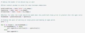
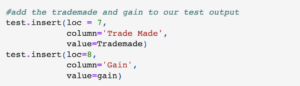
If the model predicts a higher closing stock price than the opening stock price for that day, then we will make a trade on that day. Our budget is $1000 for each day our model tells us to trade the stocks. This means we will buy as the market opens and sell just before the market closes. Then to calculate the gain from the trade we use the difference between the actual market closing price and the open market price.Assumptions:
- It is possible to buy the stock at the exact open price
- We can sell the stock at the exact closing price
![]()
![]()
164.6578013686331
Applying the above strategy and assumptions, our model generated 164.65.Sincewehadastartingcapitalof1,000 our model and strategy have resulted in a 16.47% increase in our total capital. (Note: Our value changes when we run the model again which is a problem, although it always produces a profit)
Conclusion
Our model seems to work and provide us with profits for daily trading, however, just investing long-term 1000in2014andsellingin2016resultedinaprofitof227.89 which is a 22.79% percent increase in our capital more than day trading. This is because although we made a profit overall some days we made a loss. We also assumed that it is possible to buy exactly at open and sell exactly at the close which is unrealistic except you have a quantum computer. It also requires continuous trading and monitoring of the ML system to make this method effective and this isn’t even touching on possible fees associated with trading frequently. However, with a huge amount of money, this method is amazing for quick gains in profit rather than in the long run. Also with a better model, we can reduce the number of trades where we make losses and make our results closer to 100% accuracy.
Share

Connecting Python & Snowflake for Data Analysis | Rockborne
Explore the powerful integration of Python and Snowflake for advanced data analytics in our comprehensive guide, from setup to data extraction.
22 Jan 2024

Exploratory Data Analysis with Python and Pandas | Rockborne
Explore the basics of data analysis with 'Introduction to Exploratory Data Analysis using Python and Pandas', a guide for beginners to unlock data insights.
21 Nov 2023

The Power of Storytelling with Data
This article outlines four tips on how to create compelling data visualisations.
12 Jun 2023