Why Tableau?
Tableau is a leading data visualization tool used for data analysis and business intelligence.
It has really opened my mind to what can be done when trying to understand data.
To be able to help stakeholders understand what key points to focus on when improving their business, to also being able visualize the dashboards from your mobile device.
It also allows you to be as creative as you want, but also maybe go for the more minimal, simple type of work.
Whatever visualization you have in mind, Tableau will be able to help you achieve it.
What is a Sankey Diagram?
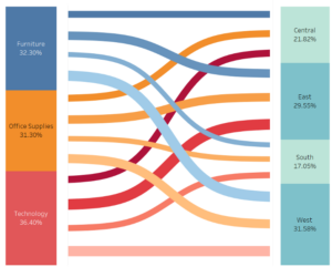
One type of visualization that Tableau allows which was really intriguing to me was Sankey diagrams.
It is used to depict a flow from one set of values to another.
The things being connected are called nodes and the connections are called links.
They are best used when you want to show a many-to-many mapping between two categorical dimensions.
Sankey chart in tableau is a good alternative to bar charts or pie charts if you wish to show flow quantities.
In Sankey diagrams, the width of the arrows is proportional to the flow quantity it represents. So, attention is drawn immediately to the most important flows in the processing system.
Here is an example I found on the internet. The Rockborne website and the data school website have step by step guides on how to make it.


