Sankey diagrams are a type of flow chart, which are typically used to visualise measurables such as cost, or distribution of resources. The nature of a Sankey diagram means it is easy to see relationships that are not immediately easy to understand. Sankey diagrams are also good to use when multiple measures are compared, as seen below. You can clearly see how the distributions vary between levels.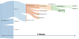
Making a Sankey Diagram with Superstore data
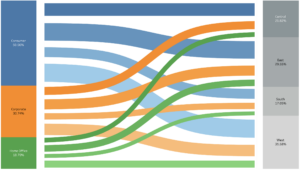 1.Once you have connected to the Superstore dataset, union the ‘Orders’ table to itself and a new column called ‘Table Name’ and the column will appear.2. Create a calculated field called ‘To Pad’ and write this equation:IF [Table Name] = ‘Orders’ THEN 1ELSE 49END
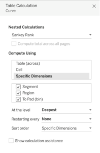
3. Right click on ‘To Pad’ and hit Create -> Bins. We want the size of bins to be 1. This will help with data densification and will also later be used to create the shape of the curves between measures. 4. Create another calculated field called ‘T’ and write this equation:(INDEX () -25) / 45. Drag ‘T’ to the Column pill and ‘To Pad’ to detail. Right click on ‘T’ and click Computer Using -> To Pad (bin).6. Create another calculated field called ‘Rank’. This will set the start and end positions for our paths. Write this equation:RUNNING_SUM (SUM ([Sales])) / TOTAL (SUM ([Sales]))7. Duplicate ‘Rank’ and rename as ‘Rank 2’. So you should have two different Rank fields with the same equation.8. Create another calculated field called ‘Sigmoid’. This will create the curve shape. Use this equation:1 / (1 + EXP(1) ^-[T])9. Create a calculated field called ‘Curve’ with this equation:[Rank] + (([Rank 2] – [Rank]) * [Sigmoid])10. Drag ‘Curve’ to the Rows pill, and ‘Region’ and ‘Segment’ to detail. Right click on Curve and hit Edit Table Calculation. Select ‘Rank’ as your nested calculation and compute using Specific Dimensions. Make sure Segment, Region and To Pad (bin) are all selected and in the order seen below.
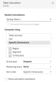
 11. Do the same again, this time selecting ‘Rank 2’ as your nested calculation and again compute using Specific Dimensions. Make sure Region, Segment and To Pad (bin) are all selected and in the order seen below.
 12. Right click on ‘T’ and click Edit Table Calculation, and again compute using Specific Dimensions. Only select To Pad (bin), like below.
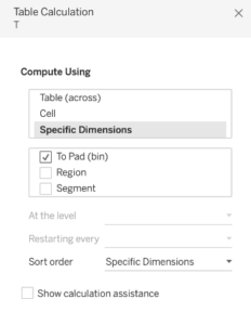 13. Right click on each axis and click edit. Choose a fixed range, with the X axis running between -5 and 5, and the Y axis running between 0 and 1. You should then click ‘Reversed’ while editing the Y axis. This will remove the ‘jumps’ between the end data points and the ends of the scales, making the curves look smoother.
14. Change the graph type to Line and drag ‘To Pad (bin)’ to Path. Your screen should look like this: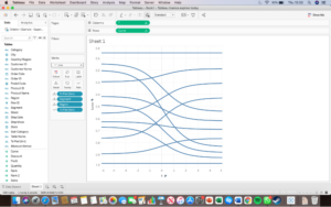 15. Drag ‘Sales’ to Size and edit table calculation. Set it as a running total, computed using ‘To Pad (bin)’.
16. Select both Region and Segment and drag them to colour.
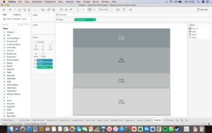
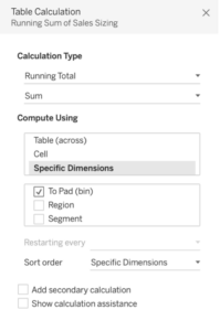 17. Create two more sheets which will be used as the sides of your Sankey. Set them up as seen in the next 2 pictures.
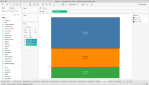
 18. Finally, combine them all in a dashboard to create the finished Sankey.


