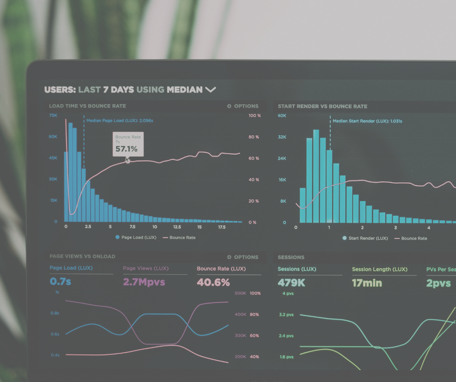
Since beginning my journey using Tableau, I have learned to form various chart types, create calculated fields and use parameters within my worksheets. The next step would be to collate all the visualisations I have fashioned into one dashboard.
I have created multiple dashboards within Power Bi and understand the key principle to show a clear story which aligns with the users’ goals. The skills are transferrable; however, I have needed to learn how to apply these to a new tool.
As I continue to work with Tableau (and other data visualisation tools), these are a few tips that I have picked up:
Plan ahead
It is very helpful to sketch out a simple design of how you would like your dashboard to look. This will save time when creating the real thing and gives time to determine the story (which you will continually discuss with the stakeholder) as the user interacts with one graph to the next.
Layout
You should have a general idea of the layout of your dashboard from planning ahead. It is good practice to split your dashboard into multiple sections to prevent cramming too much information together as well as using whitespace and padding for a cleaner look. You can do this in tableau by placing your graphs within containers, this will make it easier to edit and move aspects of your dashboard if you wish to make changes later.
It is good practice to begin your story and place the most noteworthy visual on the top left-hand side of the dashboard as this is where most users typically first look.
Appropriate Charts
Tableau allows you to create many chart types and visuals. It is vital you choose the most effective method to display the data. This will vary and depends on the type of data you’re looking at (discrete vs. continuous) as well as the experience the user has with dashboards and what they find the easiest to make sense of.
If you find your chosen visual is too messy or is showing a lot of information at once, making use of the tooltip can provide the user with a necessary breakdown of the visual by hovering over it.
Colours and Font Style
A good colour theme and font choice can make your dashboard much more appealing to the eye. Again, make sure these choices are discussed with the user beforehand as they may have a company-wide design approach they would like you to use or colour-blind users to consider. Tableau has various colour palettes to choose from as well custom options.
Using bold colours and loud fonts can bring attention to a certain aspect you would like the user to focus on.
A traffic light system is a good option if the dashboards purpose is to measure a specific goal such as sales, but beware of colours that suit colour blindness.
Remember, Tableau Desktop has a few more features here than Tableau Online.
Interactive
Try to make your dashboard as dynamic as possible for the user, this makes for a more enjoyable experience and allows you to increase the amount of information you would like to display. In Tableau you can turn your visuals into filters themselves which allows the user to drill in on key variables by just clicking into the visual. Creating parameters allows the user to determine reference lines, dates of interest and rankings which make the dashboard more dynamic.
When creating multiple dashboards, it is useful to put in navigation buttons that lead the user from one page to the next, again this makes the experience of using the dashboard more engaging.
Following these tips has massively improved my dashboards, hopefully they will help you too!
