Designing Dashboards: Six Key Design Principles to Follow When Creating Data Visualisations
Dashboarding is a way to present complex data in an easily digestible way. This helps companies gain valuable insights from their data, which can help inform decision-making, and sometimes, even lead to revenue growth.
But before you dive headfirst into creating your own dashboards, it is worth taking a step back to learn some key design principles, so you have an understanding of what makes a good (and not-so-good) dashboard.
Functionality Takes Precedence
The most important thing to remember about dashboards is this: never sacrifice clarity for aesthetics.
You need to consciously prioritise functionality and the end use of your dashboard, otherwise, it is very easy to get carried away and make things too complicated or difficult to decipher.
While this is easy to understand in theory, it can be difficult to put into practice when you are working with copious amounts of data, while trying to provide the end user with as much information as possible.
So how can you ensure your dashboard is organised in a way that is easy to comprehend while keeping in the right amount of information?
Below, we highlight some key design principles that you can follow to help you create easy-to-read dashboards. We have borrowed these principles from Gestalt’s theory of perception.
Gestalt’s Key Principles of Perception
Gestalt psychology is a school of psychology that was developed in the early 20th century. It is often credited for providing the basis for the modern study of perception.
According to Gestalt theory, we perceive information as a structured and organised whole, as opposed to an assortment of smaller pieces of information.
Our brains tend to recognise patterns when it comes to information, and we also tend to group similar elements together and simplify complex images. There are six Gestalt principles: similarity, continuation, closure, proximity, figure/ground, and symmetry & order.
We can use these principles to understand how to improve our data visualisations and make them more comprehensible and efficient.
Principle 1: Similarity
Similar elements are going to be visually grouped together despite not necessarily being next to each other. This can be useful in things like bar graphs where bars of the same colour will automatically be associated with each other.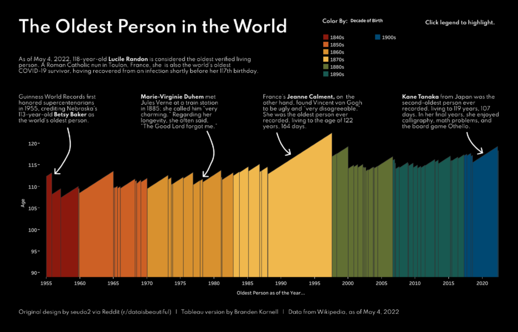 Figure 1: Similarity example. Visualisation by Branden Kornell, see Tableau version here.
Principle 2: Continuity
Our brains are most likely to construct a mental image from visual elements that are smooth and unbroken rather than the ones that contain drastic changes of direction.
Essentially our eyes follow the smoothest path. In terms of data visualisation, we can put related visualisations in a row/line in order to guide the eye across it and tell a data story.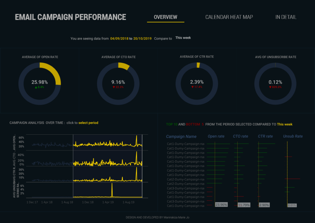
Figure 2: Continuity example. Visualisation by Manirakiza Marie Jo, see Tableau version here.
Principle 3: Pragnaz/Simplicity
When we are presented with complex objects our brains will make it as simple as possible, people will also more easily remember and understand simpler shapes/images over more complex and abstract ones. Therefore, when it comes to data visualisation, simpler is better.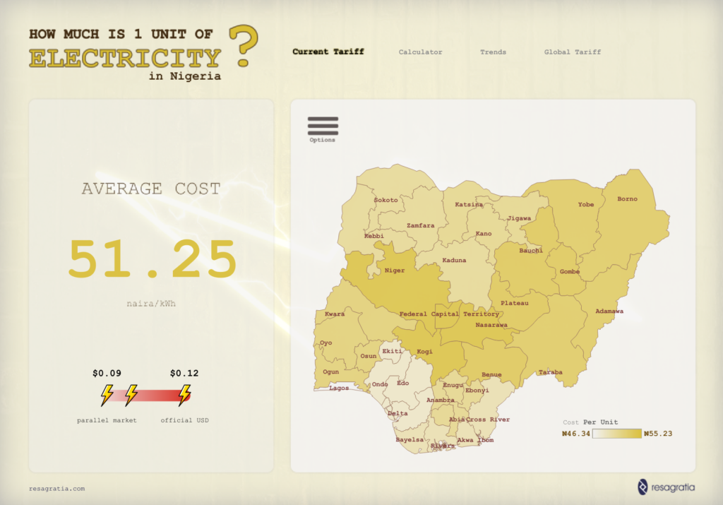
Figure 3: Simplicity example. Visualisation by Tobi Williams Babatunde, see Tableau version here.
Principle 4: Proximity
Things that are closer together appear to be more related than things that are further away from each other. Therefore, when creating a dashboard, place elements you want to be perceived as related near each other.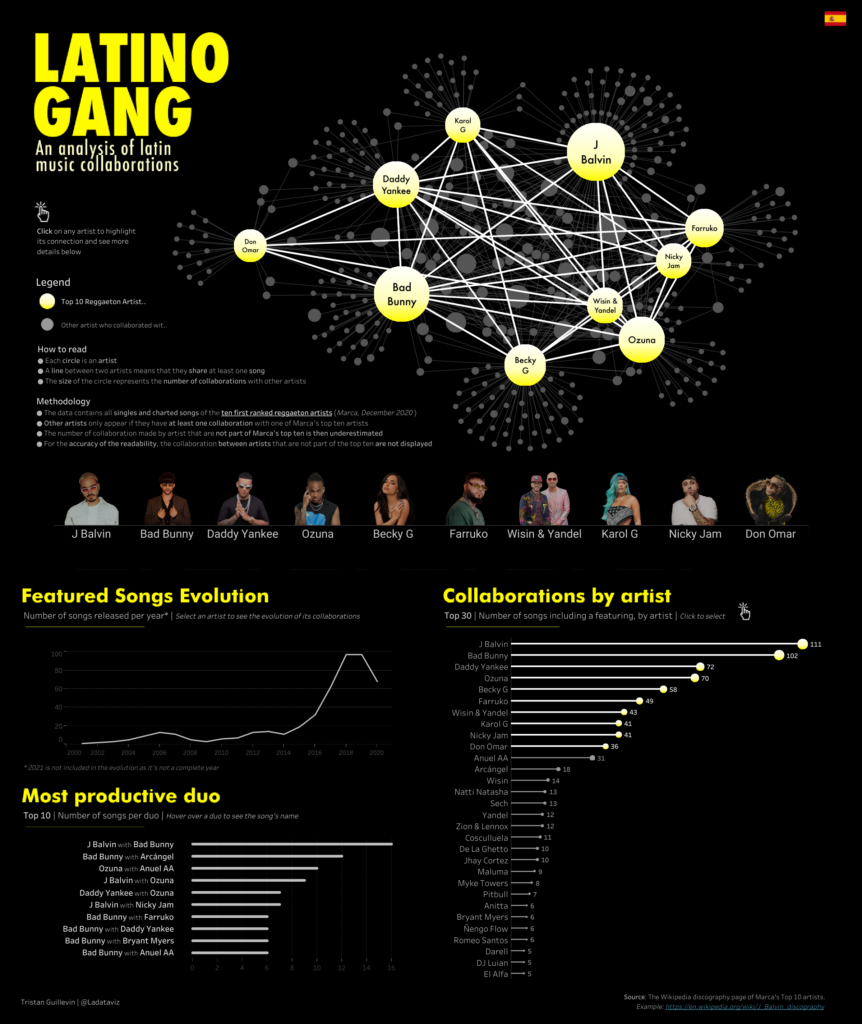
Figure 4: Proximity example. Visualisation by Tristan Guillevin, see Tableau version here.
Principle 5: Symmetry
People tend to perceive symmetrical things as more harmonious and less chaotic. Symmetry conveys a sense of order to things that we often find satisfying so it is more pleasing to look at.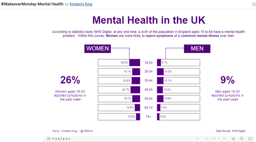 Figure 5: Symmetry example. Visualisation by Kimberly King, see Tableau version here.
Principle 6: Closure
When we see an arrangement of visual elements, we tend to look for a pattern of an overall ‘bigger picture’. So, when we see an image with missing parts, we fill in the blanks to make a whole image. Figure 6: Closure example. Visualisation by Simon Beaumont, see Tableau version here.
It is worth noting that Gestalt’s key principles are just one of many ways to understand perception and visual hierarchy. Yet, while this is just a drop in the bucket when it comes to design theory, it provides you with a strong base to help you get started in your dashboard journey.
For more information on the psychology of dashboards, watch the video below:
Is your team in need of some data training, to help level up their Excel knowledge? At Rockborne, we offer a selection of corporate training packages that can help elevate your team’s data skills. Take a look at our course list here.
