It all starts with a python.
Yep, you read right, a python. Not the slithering reptilian though, but dutchman Guido van Rossum’s now 31-year-old programming language. And for those that have had the privilege to work in data, Python is our friend, our right-hand man. Its general-purpose high-level OOP framework (object-oriented programming) has long competed with the likes of Java and C++. The same logic that is written with 7 lines of code in a C++ language can be instead run with only 3 in Python – see what I mean?
Now don’t judge me and think “ah, we have a bias here”, I’m just sharing my experiences with the snake—sorry, the language, and demonstrating some of its assets, to give each a chance to stand under the spotlight. Hopefully you yourself have used Python before and will be able to decide on the winner, according to your (business) needs of course.
Okay, in all seriousness, Matplotlib and Seaborn are Python’s in-built data visualisation libraries. They help to convert your data into flourishing illustrations that tell a story. The thought of whether Matplotlib is essential for beginners, or whether one can get by just fine with Seaborn has riddled me since first learning Python. I thoroughly appreciate Matplotlib since it provides a lot of flexibility when it comes to visualisation, but I also understand that it can be quite a complex library especially for entry-level data professionals. It can be intimidating too! The thing is, most training programmes teach the two almost in tandem which can be quite confusing for learners, and it is this confusion that paints a grey cloud over the topic.
If the purpose of data visualisation is to demonstrate distributions, trends and correlations between variables, Seaborn will do the trick. Besides the cool name, statistical plots such as scatter graphs, bar charts and more can be handled easily by Seaborn. For beginners, that’s essentially what you need. This begs the question of “why use Matplotlib instead?”. Well, because Seaborn can only do so much. Although a strong player at the start of the race, Seaborn will struggle, and for more complex work, Matplotlib ends up taking the lead. Check out Figure 1 below.
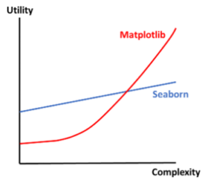
I’ll be quick – the remainder of the blog will demonstrate comparisons between the libraries using some figures and minimal code. If I haven’t bored you by then, I’ll happily highlight areas where team red (Figure 1) outperforms for data visualisation; and just a heads up, I’ll be using the ‘Palmer Penguins’ dataset to do all this (Figure 2). By the way, did you know that the penguin dataset was introduced into Python as a replacement to the ‘Iris’ plant dataset? According to a source, the Iris dataset was heavily overused.

Equal strength
When it comes to basic statistical plots, both libraries perform equally well. I have created two simple scatterplots for two variables from the above table, bill length and bill depth. One was plotted using Seaborn whilst the other, Matplotlib. Observe the following figure (3):![]()
![]()
![]()
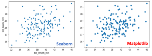 Figure 3: Correlation between bill length and bill depth in Adelie penguins, mmTake a good look at the two above, can you spot any differences? If so, hold that thought. I want to show you something else. Let’s try plotting box plots. Here I’ve taken the variable ‘flipper length’.
![]()
![]()
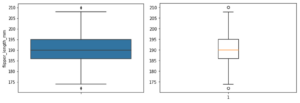 Figure 4: Distribution of flipper lengths for Adelie penguins, mmSame size figures but quite a radical difference, don’t you think? Seaborn maximises the chart area well and uses ‘The Sims’ plumbob (diamond) as a visual representation of outliers in the dataset (I’m joking). Conversely, Matplotlib feels more mature, sophisticated, and for good reason too.
Seaborn under the spotlight
Do you remember how I told you that Seaborn easily handles statistical plots? This comes down to one of its two biggest perks, simplicity, and aesthetics. By simplicity I mean it’s easy, intuitive syntax to generate plots: one line code to plot a scatter graph, nice! I can also demonstrate the same scatter graph (including the one from Matplotlib) but this time I’ve added some colour to show the two sexes.![]()
![]()
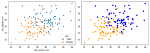 Figure 5: Correlation between bill length and bill depth for Adelie penguins, mm, with sex color-codedFirst, why is Seaborn intuitive? It automatically includes a legend and the axis titles even though I haven’t explicitly specified anything in the above code. Comparatively, Matplotlib requires one extra line of code to present the two sexes. I would have to additionally use ‘plt.xlabel()’, ‘plt.ylabel()’ and ‘plt.legend()’ to achieve the same result as Seaborn.
Now for the aesthetics. Yes, it’s subjective (all art is anyway) but I think you can decide on the plot that tickles your fancy. Let’s get some violin plots in here (observe Figure 6):![]()
![]()
 Figure 6: Violin plots showing distribution of body mass of Adelie penguins, gRight off the bat you notice a colour difference, a style difference, and one extra feature…do you see it? We’ve already established that Seaborn provides good aesthetics, but can you make out the box plot inside the violin plot produced by Seaborn?
Matplotlib, where the party is
Don’t underestimate the power of Matplotlib. This is THE comprehensive library for creating static, animated, and interactive visualisations in Python. Created by neurobiologist John D. Hunter in 2008, Matplotlib is known as a ‘low-level’ library meaning it provides a lot of flexibility over Seaborn’s one-liner codes. Allow me to demonstrate.
Subplots
A big benefit of using Matplotlib lies in subplots that is, a group of smaller axes (where each axis is a plot) placed within a grid as one whole figure. With this, you can create any number of subplots to your hearts content, just use the plt.subplots(nrows, ncols) syntax to do this. I have created Figure 7 with 4 empty subplots: ‘nrows’ = 2 and ‘ncols’ = 2, then inserted some of the Seaborn plots from before into the Matplotlib grid to support my argument.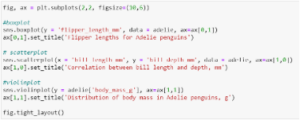
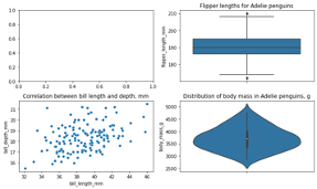 Figure 7: Seaborn plots visualised with Matplotlib’s sub-plots functionalityLooks good right? Now you can present your results as one body that allows for quick and easy comparisons. I left the first plot empty intentionally.
Annotations
An extension of some of Matplotlib’s capabilities is annotations, i.e., the addition of text, shapes, and symbols to emphasise certain components of your charts. Say for example I wanted to indicate the presence of two (unlikely) outliers from the Seaborn scatter plot in Figure 3. I can do this by typing the following code to achieve what I want. You can obviously take this concept and build on it.
Go ahead, expel those outliers!

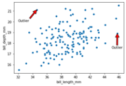 Figure 8: Annotations achieved using Matplotlib
Let’s go 3-D
Statistical plots in 2-D can be considered the norm. As far as data visualisation is concerned, there really isn’t much you can do to help your stakeholders understand 3-D plots easily. It’s complex stuff. Their appearance can sometimes be ghastly if plotted ineffectively. But you never know, they can be handy, and for that, Matplotlib has you covered. Just utilise its ‘mplot3d’ toolkit and pass the keyword ‘projection=’3d’’ to a function like ‘plt.figure.add_subplot()’ to print your chart in three-dimensional form. Observe Figure 9.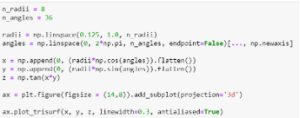
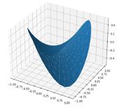 Figure 9: 3D plot generated using Matplotlib (plot shown right)
So now what?
Matplotlib doesn’t just stop there, it houses a plethora of functionalities to produce plots that are production ready. It’s a candy store with many available toolkits. If you are interested in exploring further, I highly recommend having a read of the documentation for Matplotlib 3.5.2. Here’s the link: https://matplotlib.org/stable/index.html (You can thank me later…)
Summary and Conclusion
You’ve now seen witnessed some differences between the two data visualisation packages. Seaborn is a high-level library with simple syntax that conjures complex statistical plots; these are aesthetically pleasing. But Seaborn is an addition to the foundational Matplotlib library – it was built on top of it, so what does that mean? It means Seaborn can be further upholstered with stronger functionalities using Matplotlib. The basis of my blog was to present the pros (mainly) and cons of each library for you to decide to use for your own data visualisation endeavours. For beginners, try Seaborn first, then once you are comfortable and ready to run, transition into Matplotlib. You would have by then naturally understood the limitations of Seaborn. But don’t just choose one to learn, have a go at both, then decide.
Happy visualising!

