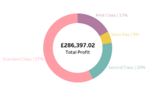
Data Source – Sample Superstore Version 2021 How to create the above doughnut chart – using Tableau’s Superstore dataset.1. In the marks pane to the left, change the chart type to “pie”.2. Locate the ‘numeric’ field onto the angle option in the marks pane. In this example we want to show the total profit amongst the different shipment methods, hence ‘profit’ is dragged to angle.
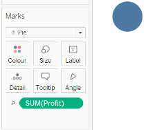
3. Locate the ‘categorical/ qualitative’ variable to the colour tab in the marks pane, here it is the ‘ship mode’.
4. Simultaneously hold ctrl and click-drag the dimension variable in the marks pane, to the “label” tab and repeat this step for the measure.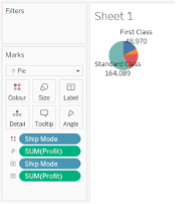 5. To enable clearer reading, change the fit from “standard” to “entire view” using the drop-down.
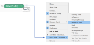
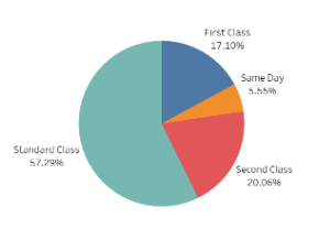
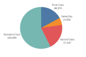 6. Clicking the drop-down of the numeric label, follow through to quick table calculation and select percent of total. In doing so it should return the pie chart below.
 7. Now to convert the pie chart to a doughnut chart. Enter the formula min(1) in the columns panel. Tableau will automate this as an aggregate.
![]() 8. Ctrl-click drag this pill to its side, to copy the pie chart.
8. Ctrl-click drag this pill to its side, to copy the pie chart.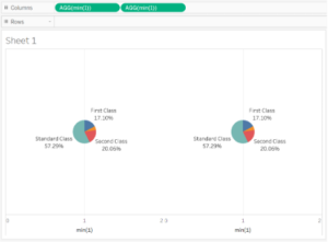 9. In the marks pane to the left, select the second pie chart, AGG(min(1))(2) and right click in the measure values and select “clear shelf.”
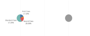
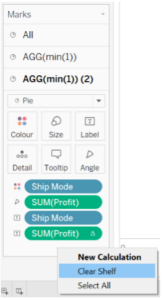 10. This now creates an empty pie chart, and we will move it on top of the pie chart to the left, by right clicking the axis at the bottom and selecting “dual axis.”
![]()
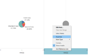 11. Now in the AGG(min(1))(2) pie chart change the colour to match the background and change the size of this chart so that it is smaller than the original.
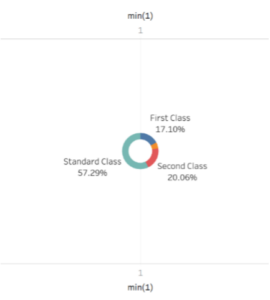 12. Tidy up the background by right-clicking on the axis and removing the headers.
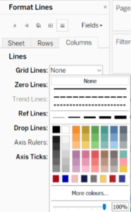
13. Convert the percentages so it does not show 2 decimal places by clicking on the drop-down of the numeric label field, i.e. SUM(Profit). Then click “format” and in the pane window to the left, change to percentage and set decimal places to 0.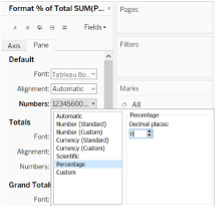 14. To remove the faint grid line in the back, right click on the page and select format, click columns in the left fields pane and change grid lines to “none.”
![]()
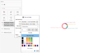
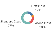 15. Let’s change the format so the labels appear as “Ship Mode | Percentage of Profit.” Select “All” in the marks pane, click label, then click the ellipsis next to “Text” and change the layout in the pop-up window as seen below.
16. Let’s change the colours. There should be a legend that shows the colours of the ship mode. Click on the drop-down as you hover furthest to the right and select “edit colours.”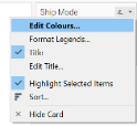 Choose the colours of your preference for each item and click ok.17. To match the labels with the colours of the segments on the chart, select label and click the drop-down by font, then choose “match mark colour.” Change the size of the font if all categories cannot be seen.
 18. Let’s add the total profit in the centre. Drag profit to the “label” pane of the second pie chart i.e. “AGG(min(1))(2).” Again, click label, ellipsis of font, and change the colour, boldness, and size accordingly. Then resize both chart types, so that all entries can be well read using the “size” option for each chart in the marks pane.
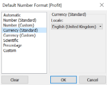
19. Profit should appear as a currency, so in the “Orders” table find profit, click the drop-down, select default properties and change the number format to currency.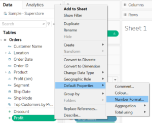
![]()
 20. Following all the steps above you should now have successfully created a doughnut chart similar to the one below.