Microsoft Excel, best known for its fundamental spreadsheet capabilities, transcends mere data manipulation. It serves as a robust platform for insightful reporting, offering an array of advanced features that transform raw data into visually compelling and easily digestible reports. Beyond the basics, Excel harbours a suite of functions tailored specifically to enhance reporting, facilitating the creation of professional, dynamic, and informative documents. In this blog post we are going to explore some of the main features that elevate Excel’s prowess in reporting. We will start by covering Excel Tables and their main features such as dynamic data range expansion, slicers, total rows, styles, reordering of rows and columns. Finally, we are also going to cover three great ways to enhance your reporting: hyperlinks, sparklines and conditional formatting.
1. Excel Tables:
Excel Tables serve as the foundation for organised and structured data. They streamline data management by providing automatic formatting, built-in filtering, and easy expansion as new data is added. For reporting, Excel Tables offer a structured layout that allows for dynamic referencing in formulas, making data analysis and report generation more efficient and adaptable.
For example, when working with inventory data that is often used to check latest stock information, you can make it a table and make sure that the data is easily accessible and updated. Ctrl + T will turn your data into a table, or you can use the menu bar by clicking on Insert and then Table:
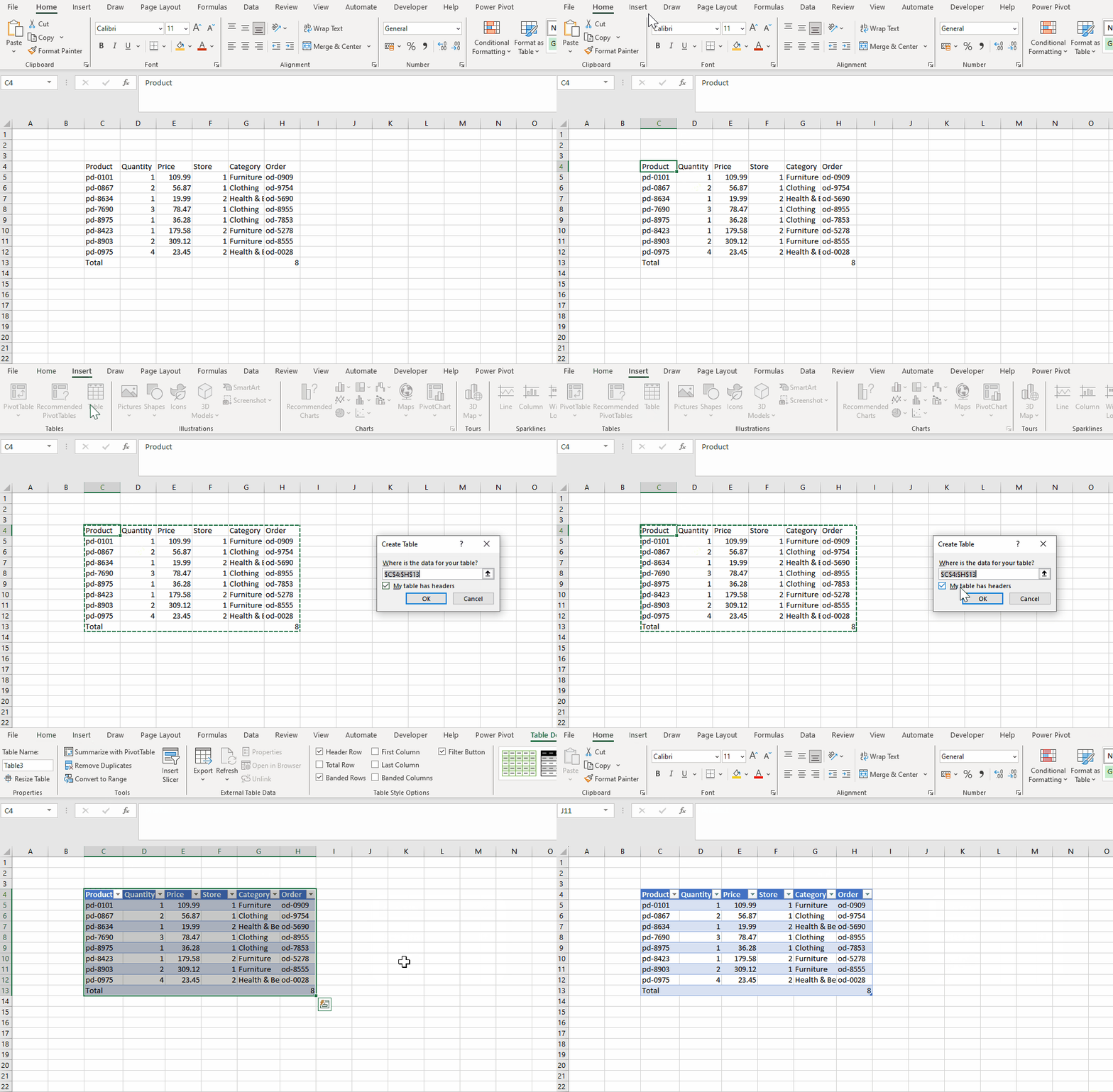
In the points below you will see the main features of Excel Tables:
Dynamic Data Range Expansion: Excel Tables automatically expand to accommodate new data entries, ensuring that any additional rows or columns are seamlessly incorporated into the table structure. In the case of the orders table, every new order added automatically adds a new row that inherits the formatting of previous rows, and the same happens for new columns: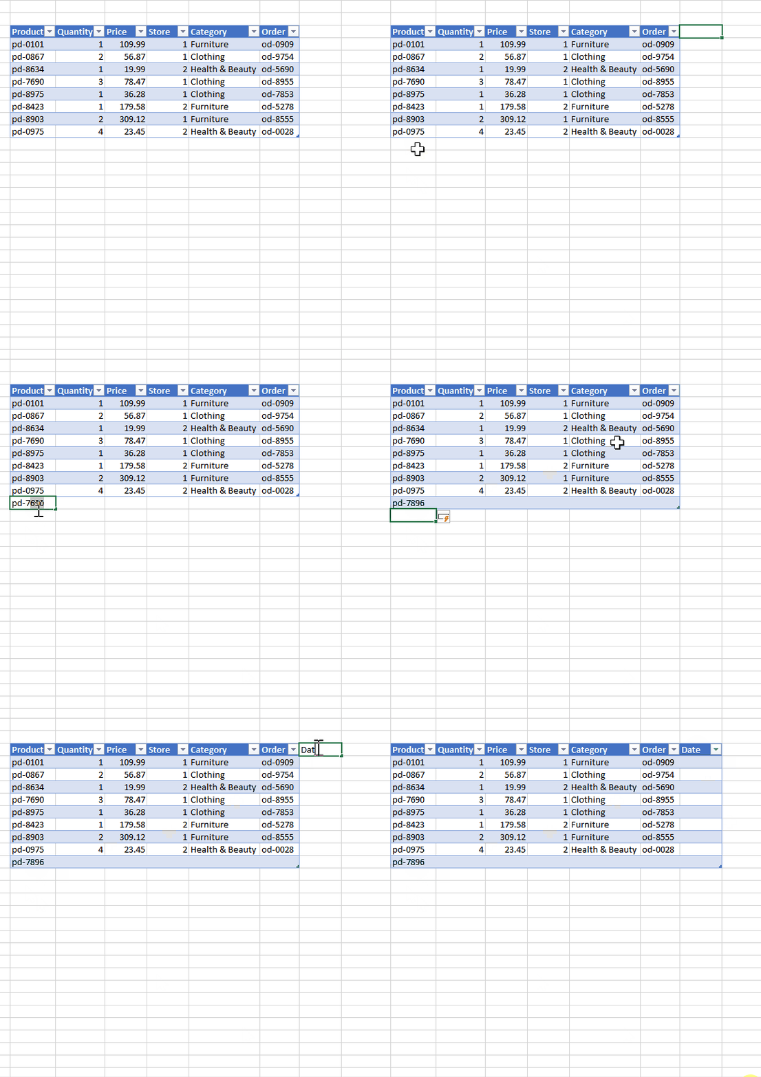
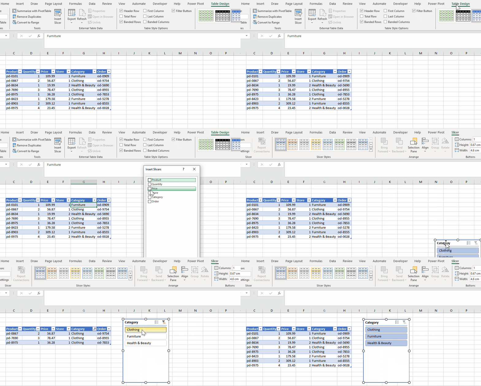
Slicers for Easy Filtering: Slicers provide an intuitive and visual way to filter data in Excel Tables. They act as interactive buttons, allowing users to filter data with a simple click, enhancing the user experience and facilitating dynamic data exploration. To facilitate the visualisation of the orders by product categories, you can add a slicer that will act as a filter. The user then just selects the category they want to see, and the table is filtered down to that category.
 Total Row for Quick Calculations: Excel Tables include a total row that simplifies common calculations, such as sum, average, min, max, standard deviation and count, without the need to manually create formulas. It is often the case that we want to have some summary statistics easily available such as the total number of items ordered and their total price:
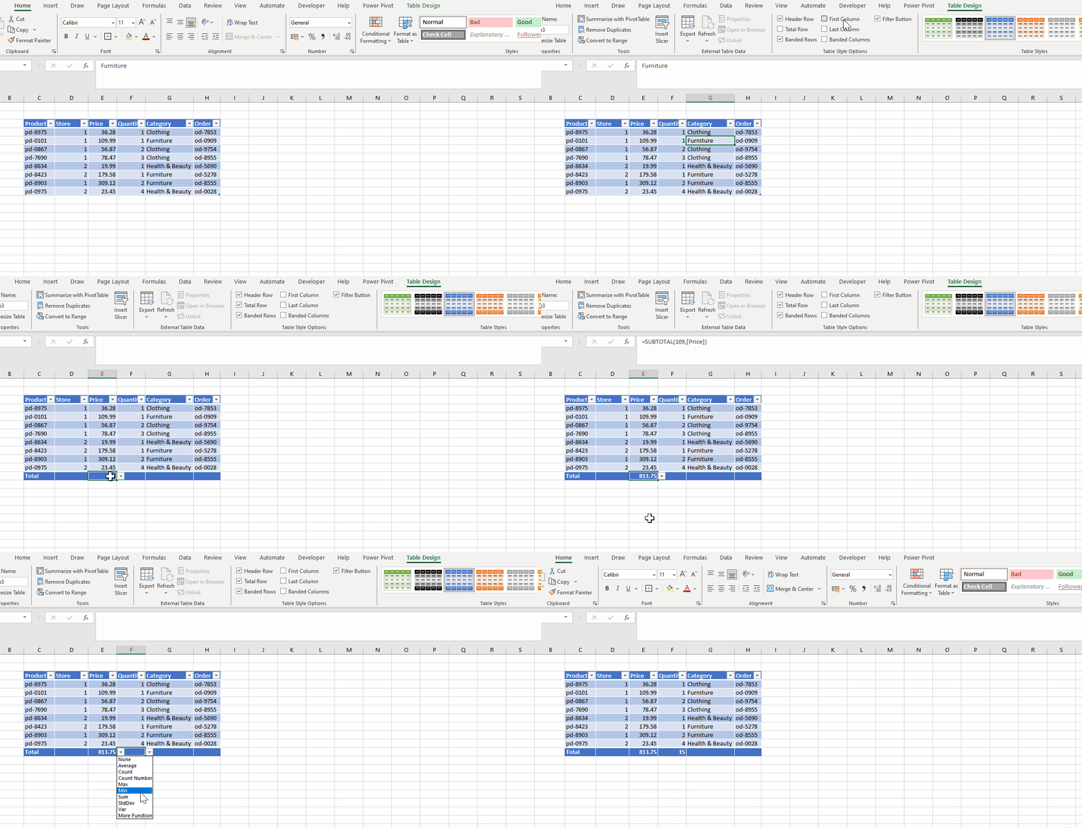
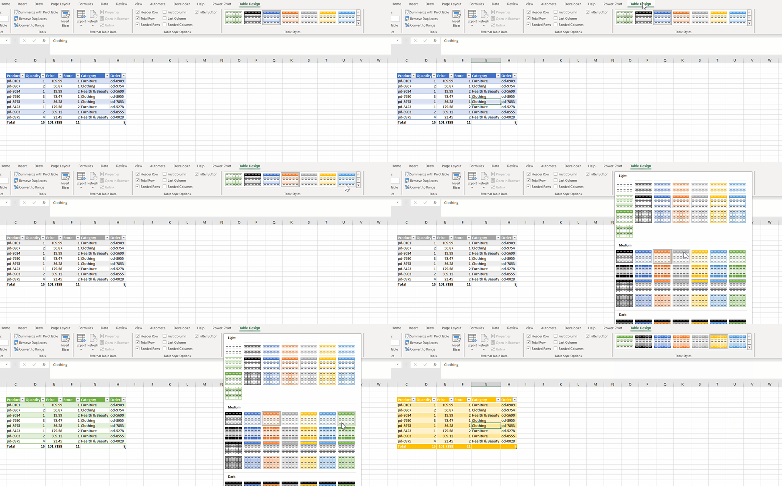
Easy Formatting and Style Consistency: Excel Tables offer consistent formatting, making it easy to maintain a uniform style throughout your data. Additionally, the banded rows enhance readability. You can also chose to have a different format on the first and last column, and turn on the banded columns:
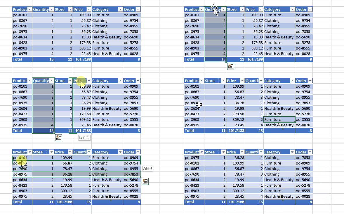
Reordering Columns and Rows: Excel Tables allow for effortless rearrangement of columns and rows by simply dragging them around.
2. Hyperlinks:
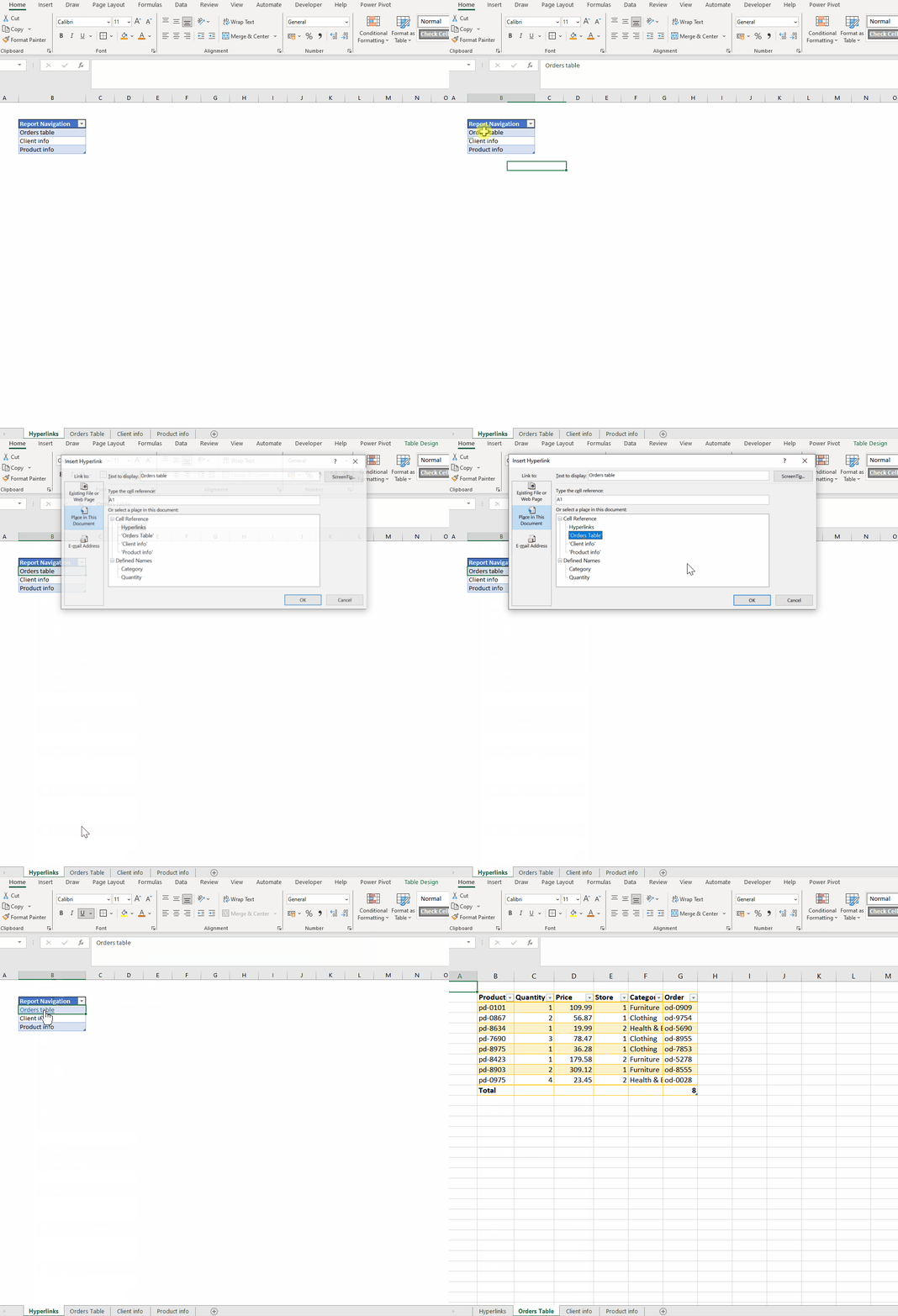
Excel’s Hyperlink feature is invaluable in reports, allowing users to link within the document, to external sources, or other files. This capability enhances the interactivity of reports, enabling easy navigation between different sections, sources, or supplementary information, providing a seamless user experience.
3. Sparklines:
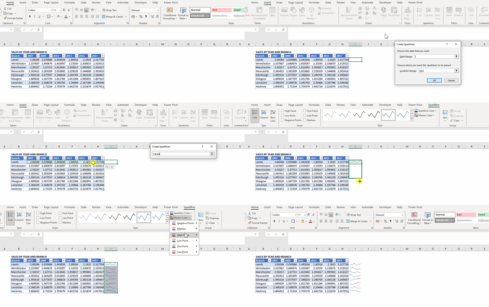
These small, word-sized charts within a cell offer a snapshot of data trends. Sparklines provide a quick visual representation of data, making it easier to identify patterns and trends within a report. Their compact size makes them an ideal addition to tabular data, enhancing the overall visual appeal and insightfulness of reports. In this example, it is easy to see how each branch is performing in time and spot trends throughout the years with the high point marker:
4. Conditional Formatting:
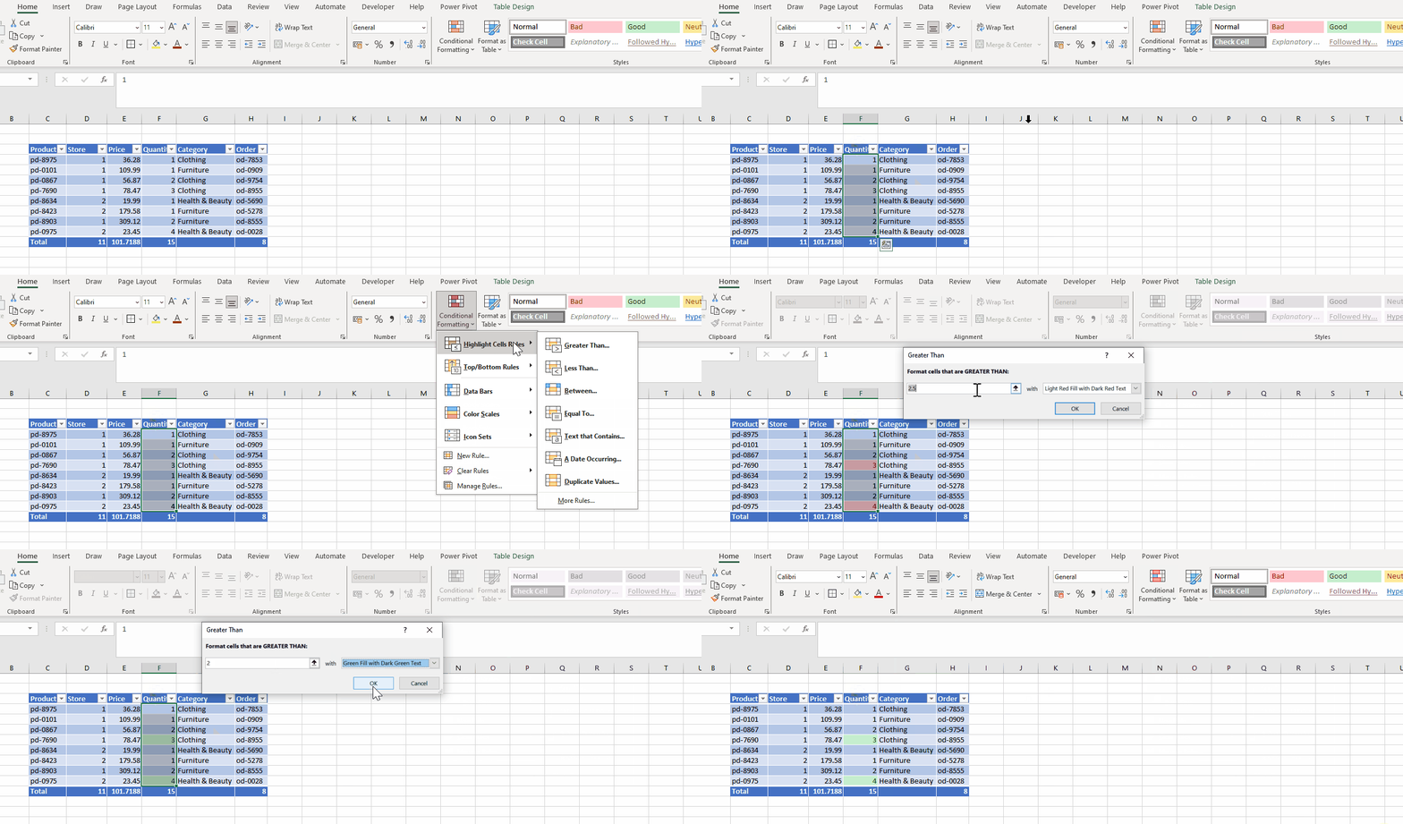
This feature enables the user to format cells based on specific conditions. In reporting, conditional formatting highlights important data points, trends, or exceptions by applying visual cues like colours, icons, or data bars. It aids in emphasizing critical information, making reports more accessible and impactful. This example shows how to highlight all orders with a quantity more than 2:
 In summary, these features significantly elevate Excel’s reporting capabilities. Utilizing these functionalities empowers users to create comprehensive, interactive, and visually appealing reports that convey information effectively and efficiently. Mastering these tools can significantly enhance reporting capabilities, transforming raw data into impactful insights.


