06 Oct 23
Data Accessibility Tips: Making Visualisations Colour Blind Friendly

Adam Copestake
Data analysts often use charts, graphs, and dashboards to help explain complex data relationships or concepts to different stakeholders. While data visualisations can be a useful tool, they can be difficult to read or create if you are colourblind. Here’s why colour blindness affects your ability to interpret data visualisations, along with some tips on how to improve data accessibility to make your data visualisations as colour-blind-friendly as possible.
In this Article

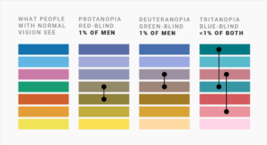
Colour blindness, or colour vision deficiency, stems from a genetic variation that affects how we perceive certain colours. The gene which encodes colour-blindness is recessive and lies on the X chromosome, since those born male have only one X chromosome, they are much more likely to be colourblind. For an individual with two X chromosomes to be colourblind, both copies of the gene must be faulty, and this is much less likely. As such, around 8% of men and 0.5% of women globally are colourblind. The most common form is red-green colour blindness called deuteranopia, and this is the version that I have.
Explaining colour blindness to someone without it can be tricky. Although it is called a red-green deficiency, it does not mean I see red and green the same – a red football kit does not blend in with the grass behind for example. Instead, it means that colours containing these hues can be tricky to distinguish. Blues and purples, reds and browns, yellows and greens can all be difficult or even impossible pairs to distinguish. Other versions of colour-blindness exist such as tritanopia (blue-yellow) and even monochrome vision but these are much rarer.
Before starting my career in data analytics, colour blindness had been a mild inconvenience at worst. Accidentally colouring the sky in purple crayon instead of blue is not an issue that persists much into adulthood. Since joining the world of data, however, it has reared its head again. The first time I encountered this issue was actually during an online test as part of a job application. The task was intended to assess my “attention to detail” by asking me to spot all the differences between two different images. What were these images? Two colour spectrum charts. I did my best given the circumstances and finished the test, trying not to think about how those few marks could decide my outcome. This is one example of how a simple oversight can have significant consequences on data accessibility.
Colour Blindness and Data Accessibility in Analytics
Presenting data without using colour would be extremely difficult. Colour can act as a tool to compare different categories, a simple one being different coloured bars for each gender in a bar chart. The values of the data itself can be shown using colour, such as in heatmaps. Colour is also used to make visualisations appealing, keeping our minds engaged while also drawing our attention to the key features that are being communicated.
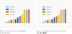
These visualisations are often used to make important data-driven decisions and as such, it is crucial that none of this information is lost due to issues perceiving the colours. Data accessibility is paramount in this context, say if two adjacent segments on a pie chart appear the same colour to someone and there is no way to distinguish them, key information is lost. Even if some colours are not impossible to differentiate, it often requires a lot of concentration and this means more mental effort is put into reading graphs instead of interpreting what the underlying data is showing. Often times during a presentation I have lost track of what the presenter is saying because I am too focused on trying to read the visualisations.
Practical Tips for Improving Data Accessibility in Visualisations
Here are a few tips on making visualisations as colourblind-friendly as possible.
Data Accessibility Tip 1: Use fewer colours – trying to interpret a complicated graph is almost impossible if there are many different categories all with their own colour. Consider grouping certain categories together or limiting which ones are shown to reduce the number of colours necessary. On heatmaps especially, less is more. A very common choice which poses issues is a red-yellow-green colour scale – is that yellow or is it pale green? Sticking with two colours where possible is best.
Data Accessibility Tip 2: Use preset colour palettes – Anyone familiar with the matplotlib Python package or Excel charts will recognise the classic blue and orange colours used in their default themes. This is because blue and orange are often cited as being the easiest two colours to distinguish for colourblind people. Many of the default themes are designed with data accessibility in mind, so using these is often a safe bet, although not a guarantee. If you want to customise the colours, then many accessible palettes are available online to choose from.
Data Accessibility Tip 3: Use data labels – this is a very simple way to remove any ambiguity. Having a small callout label saying what the category or data value is means that no mental effort is wasted trying to read the legend on the graph. This has the added bonus of allowing the use of colours that are in keeping with the theme without the worry of data accessibility.
Data Accessibility Tip 4: Use other visual cues – dotted lines, dashed lines and hashed regions can all be used to distinguish things on a chart without using colour. This is especially useful as no information is lost when printed in black and white.
Data Accessibility Tip 5: Use an online checker – Coblis have an online colour-blindness simulator which allows you to upload an image and see it through the lens of various different colour-deficient lenses. This is also an interesting way to see how colourblind people see the world and get an understanding of the differences in vision.
Data Accessibility Tip 6: Ask – the prevalence of colour blindness means it is likely that someone has it in every workplace. Asking someone who is colourblind to do a quick check of your visualisations is probably the easiest way of ensuring accessibility while also making that individual feel valued.
Rockborne’s mission is to bring diversity into data. In a field where the ultimate goal is to extract meaningful insights from complex datasets, having a team with diverse skills, backgrounds, and abilities enriches the analytical process. In such a team, not everyone sees the world in the same way, but in the case of colour blindness, this is quite literal. The simple steps outlined in this blog can help to ensure this does not act as a barrier for anyone in this industry.
Interested in joining our diverse team? Find out more about the Rockborne graduate programme here.
Related posts
Life at Rockborne20 Jun 25
Federated Learning: The Future of Collaborative AI in Action
Federated Learning: The Future of Collaborative AI in Action The way we build, deploy, and govern AI is evolving, and so are the expectations placed on organisations to do this...
09 Sep 24
Tips to Succeed in Data Without a STEM Degree
By Farah Hussain I graduated in Politics with French, ventured into retail management, dabbled in entrepreneurship, a mini course in SQL and now… I am a Data Consultant at Rockborne....
Farah Hussain
15 Apr 24
Game Development at Rockborne: How is Python Used?
Just how is Python used in game development? In this blog post, we see the Rockborne consultants put their theory into practice. As the final project in their Python Basics...