23 Aug 23
A Step-By-Step Guide to Creating Your Own Data Visualisations

Ewan West
If you’ve ever wanted to create your own data visualisations but aren’t sure how, then you’re in the right place. This guide will cover each step, from finding your data to creating a range of visuals.
Step 1: Finding Your Data
The first thing you need to do before visualising your data is to actually get the data! Your data source will be dependent on the context and style of visualisations you want to create, but a common source is Kaggle (kaggle.com). This website boasts nearly 250,000 datasets, covering a wide variety of topics, and all are available at no cost. Other benefits of Kaggle include the community, where the datasets can be rated, and you can see the kind of projects other people have completed if you need some inspiration.
I personally used this Kaggle dataset during my project, which contains data about over 1,000 Pokemon. It’s available as a .csv, all with one click. If Kaggle doesn’t have what you’re looking for, many similar websites exist, or you may have to source the data from elsewhere, for example, I sourced supplementary data from a Pokemon website called Smogon, where the data I needed existed in text files.
Obtaining this data is as simple as right-clicking and downloading each file, but you could go one step further and web-scrape the data, using a Python package such as BeautifulSoup. You can even generate your own data with an IoT project.
Step 2: Cleaning Your Data
Data comes in all shapes and sizes, and it may be ‘clean’; or it may not. Kaggle datasets tend to be well-maintained and fit for purpose, but there is always the possibility they will need some changes or cleaning. If you have a simple .csv file, loading it into Excel is a great way to start some initial data exploration, such as checking the columns you have are correct, and checking for null or missing values.
This can be taken one step further using the common Python library, Pandas, especially with the .describe() function, giving you a summary of each column. If you want to go even further, you can use software such as Tableau Prep or Alteryx which have specialised tools available for data cleansing.
Personally, I used Alteryx for my data cleansing, which allows for sophisticated parsing of data which would otherwise be quite troublesome. The .csv file was relatively clean, but the text file required some cleansing, here is an example of my data before data cleaning in Alteryx:
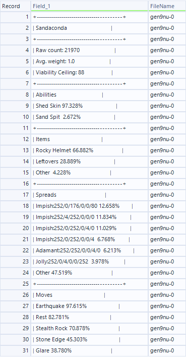
As you can see, the data from the source needed a good amount of data cleansing done to it before it could be usable. Firstly, there are a lot of characters that do not provide any information, such as the pattern of + and – which represents a new section, and the pipe (|) symbol surrounding each row, which needed to be removed. This is easily achievable with the Find and Replace tool, which allows you to specify a character, or string of characters, and replace them with another string, in this case, I removed them entirely.
The next step is to split the data from a singular row into columns, for which I used the Text-to-Columns tool. By using a space as a delimiter, every piece of information was parsed into a separate column, allowing for much easier data manipulation. Each row would now still have all the information as before, but in a much easier-to-read format, and with meaningful names, as seen below:
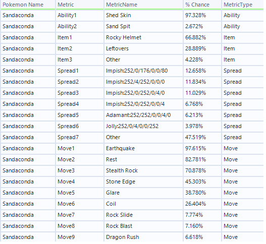
The data in this format is much more accessible and will allow us to use the data in our visualisation tool much more easily. Before that, however, we need to put the data somewhere, for which we have a number of options.
Step 3: Storing Your Data
The most simple way of storing your data is in a flat file, such as a .csv file, which is then usable by nearly every visualisation tool, but there are also other methods that may be more suitable.
SQL databases are common for storing such tables, and relationships can be mapped between them, which can be very helpful if you have a lot of tables. My database of choice is PostgreSQL, but there are plenty of options available.
When creating a database, it is also important to determine whether you want to host your data in the cloud or create a local database- this is largely dependent on the use case. For this project, I was the only one that was going to be using this data, so I created a local database (which is also totally free), but for bigger projects or to ensure scalability, using a cloud provider such as Amazon Web Services (AWS) or Microsoft Azure to host the database for you.
Whichever option you choose, you can then use SQL to manipulate your data, or simply just store the data- this is known as a data warehouse.
Step 4: Visualising Your Data
Whether you store your data in a database or as a flat file, visualisation tools will be able to access this clean data and then present it in a meaningful way. The most common visualisation software are Power BI, Tableau, and Looker, but you can use Python’s Matplotlib or Seaborn, which is especially useful if you’ve performed all of the above steps already in Python. You can even use Excel to visualise your data, which is probably the easiest method, especially for simpler datasets.
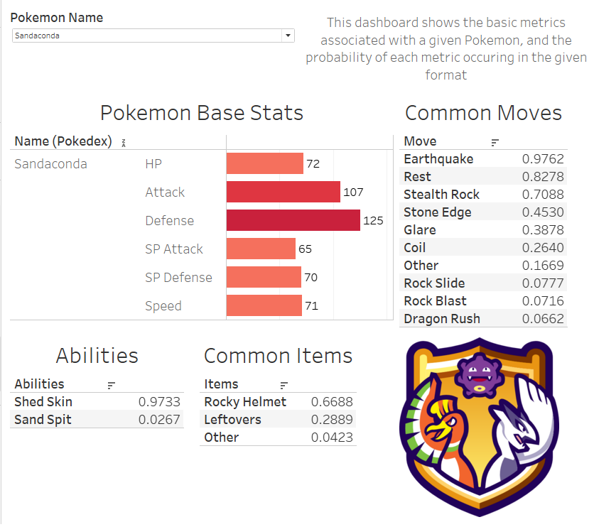
I chose to use Tableau for my visualisations because of its intuitiveness, allowing you to drag and drop columns from your data source and create stunning visuals with ease. Bringing together both the data sources, with the bar chart from the Kaggle data and the tabular data from the text file data, produced this simple dashboard.
Through this guide, we have taken data from multiple sources, cleaned the data, stored it in a local relational database, and visualised the results in Tableau.
Interested in joining our diverse team? Find out more about the Rockborne graduate programme here.
Related posts
Life at Rockborne20 Jun 25
Federated Learning: The Future of Collaborative AI in Action
Federated Learning: The Future of Collaborative AI in Action The way we build, deploy, and govern AI is evolving, and so are the expectations placed on organisations to do this...
09 Sep 24
Tips to Succeed in Data Without a STEM Degree
By Farah Hussain I graduated in Politics with French, ventured into retail management, dabbled in entrepreneurship, a mini course in SQL and now… I am a Data Consultant at Rockborne....
Farah Hussain
15 Apr 24
Game Development at Rockborne: How is Python Used?
Just how is Python used in game development? In this blog post, we see the Rockborne consultants put their theory into practice. As the final project in their Python Basics...